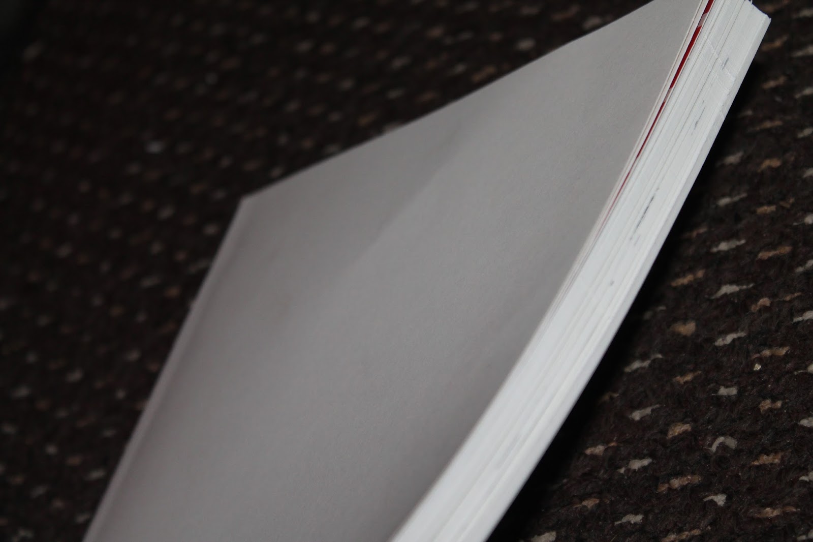
I tried to glue bind this copy of the book because I accidentally forgot to print it with signatures so I couldn't bind it with book bind sewing. Some of the pages are already falling out - which tells me altogether the 103 pages are too heavy to be held with glue, so when I come to do the actual finished colour version I will print it signature style so I can attach it properly. I was very excited to print it all off and I think it looks gorgeous now it's all bound and even with the white protection cover I put on, it looks beautiful. Its so exciting to hold such a thick proper-feeling book and know I've done it. I can't pull back the pages very much because the glue won't hold; but to just compare and show my progress its an acceptable draft.

It looks sort of like a colouring book at the moment, and I hope to finish it completely with digital colour as soon as possible. I reckon five a day for a month will be enough. then I'll definitely have it finished for the degree show. I've always wanted to write and illustrate a whole children's books and now I have! Even though there's been plenty of times I've wanted to throw it all away and think 'sod it' and 'oh I'll just keep that previous image in there- it'll be fine!' and I've kept on and on and its paid off! I'm glad I didn't take the easy route now. Again, there's a lot of room for improvement but in the time that I've got, I did what I could. THIS BOOK IS A DRAFT. I cannot stress that enough. I have sent a copy of the black and white version to my friend of a friend's mum who works for the welsh government, in the finance and policy office for adult mental health. She works directly with children's offices so I hope she can take this book further. Perhaps provide funding or help me publish it.

It's taken me four months and 531 drawings for each book, plus backgrounds (so nearer 1706 drawings) to get to this stage and look how lovely it looks! When I do the front cover in the final book It will have the dragon on. I will submit the three books along with the sketchbook I've been working in - my drafts and my blog.
The three sketchbooks will represent - the first draft, showing ideas and placement, and the second Draft is improved, and more polished - changes, characters showing more movement and emotion - and the third draft is coloured and fine tuning.
IMPROVEMENTS - NOT ALL OF THE PAGES, JUST A FEW TO SHOW WHAT I'VE BEEN DOING.
Actual front cover- Autism looks more in proportion - more friendly and less like a duck billed platypus. I will put the big font in for the title later when I colour it. I have also tidied up all the writing inside and changed the fonts and cut down the sentences so it's easier to read.
 |
| Publishers note - MY COPYRIGHT! Not yours hehehe |
Old vs New black and white (I had to put the white cover on it to bind it)
The first page shows considerable improvement. Less empty and the scene is set more. Also the characters are interacting more; Ben is actually looking at Charlie as opposed to the direction. Also the perspective on the fence has changed so It actually looks like Charlie is climbing the fence. Charlie's head has been made a more believable shape too. I am very proud of this page.
To balance this image better, I put Ben and the mother on the right side so the text relates to them on that page, and then Charlie on the left (where the text about him is) Also I thought if the mum was playing with them, and engaging with them both it would be more believable that she was their mum) I made the room's lines cleaner and more defined; also put a little Easter egg foreshadowing in there as well: Charlie's bed-sheets have dragons and dinosaurs on them - all the characters Ben is about to meet are on the pattern. (Also Charlie is holing the Autistic dragon)
I thought having Charlie sitting on his bed would make him look more uncomfortable than if he was playing on the floor. I want Charlie to look like he's being put out by normal little things - whereas on the other version, Ben looks like
he is the autistic one because he doesn't want to play with Charlie.
On this one Fumio said there was no need to have the speech bubble so I got rid of it and made it two separate images as opposed to one big image. It works better this way I think. I perfected the perspective on the houses too - which I have got many compliments about. I also put Charlie closer to Ben so theres not such a huge gap between them. It actually looks like he's following his brother now. In the birds eye view, I hate the car I drew. I can't draw cars yet let alone from above. So I know the perspective is off on that one.
I actually loved the little Charlie I drew here, so I did reuse the image, but using the grid for perspective, I got the stairs right and put him on the bottom step so he actually looks like he's climbing the stairs as opposed to hovering on them. I left the family portrait out for now - I don't feel it essential to the story but if I was to do this book in best I would put it in.
Because I redrew the bedroom, and this scene was zoomed in - but at the same time as I had to include Ben's face (so you could see his expression. Its no good having him talking to the reader if you can't even see him in the scene) I had to figure out how to put the mum in without her ending up in the gutter. So I Put her towards the end of the bed. She's kneeling down - that's why she looks so big next to the tiny beds. Because these are actually like tiny little camping beds. I prefer the mum's design now. I love her soft lines and her round hair.

On this one I removed the park scene because it was redundant and was just taking up room. So I decided to put the two bedroom scenes next to each other. I feel the light and dark contrast nicely together. I think I prefer the original mum on this spread, because the pose is perfect and she actually looks like she's kissing his head, whereas on the new one she looks more like shes sniffing his hair. But it's just a personal thing. I love the new concept art for the mum, I don't like the pose as much.

Zooming in on Ben's face shows more emotion - more fear. It really sets the scene more
I added a transition page because having it leap suddenly from the dark bedroom, to him talking to the dragon just looks weird. So I did a page for you to see Ben's eyes adjusting to the change of light. I'm not keen on the final image of Ben with his mouth open, but it fits the scene better. If I was redrawing this again I would change that image.
Critics told me that Depression didn't look vulnerable enough. He looked too proud. So I changed it.
To keep the style consistent I redid this page as well. Made him more vulnerable and showed his expression more.
Turned this from two images into one giant picture so it looks like anxiety is following them. I made anxiety different strengths as she's walking so you can see her slowly gaining confidence. (I made her pale, getting stronger because otherwise It would have looked like three anxiety's walking)
From deleting several pages and adding more, the pages have been set back and moved around a bit.So now ADHD is on the left as opposed to the right. I prefer how the characters look now. They have more movement and character than before. They actually look like they have personalities now.
This was my original idea - having little dragons in star suits rolling around the sky while Ben sung the nursery rhyme. But to save time I just ended up doing plain stars. So I went back to the original idea and It's so cute! I think it's a lovely little addition to the book. Instead of doing a birds-eye far away view of the three characters as well, I did a close up of their faces and conversation. So you can see the emotion on Tourette's face.
Removed the backgrounds and focused more on the expression on Autism's face in each scene
I couldn't find the original background bedroom image for the last scene but I decided the moment would be stronger if there were no background distractions anyway. So I drew them in white space - a metaphor for nothing matters at that particular moment - just what is happening with them.

It broke my heart to remove this page because I was so chuffed with how I did the water - however I changed it up and instead of having Ben and Autism coming down into the cave, and then across the water on that path, and into the other cave, I drew them coming through that side and walking towards the viewer across the lake. It made more sense visually. I didn't listen to Fumio in this instance, because if I had put Tourettes on the right page, instead of the left, it would simply be too much on the right. The path, Ben, Autism AND tourettes? The image would look unbalanced.
I swear to god this image was saved in on 300dpi however it's gone horrible pixilated and it just ruins the look of the image. I will try to amend this if I have time. However as it is a draft book I can live with one or two of the images looking a bit fuzzy. Its the overall affect I'm interested in.
Changed his expression - made his face rounder. Yes there are a few stray scrapy lines but again - it's a draft book. The important thing is that now he is actually
looking at anxiety and engaging with her.Also While tidying the writing up, I made it fit into two lines, as opposed to many more.
Got rid of the heavy black shadowing on the images and made Autism's face framed better and less deflated looking. I also have been playing with angles (left page) and how the dragon's face would look straight on - instead of just constantly drawing profile images.
Here's what I've basically done for this book: of course I have improved every single page but can't show it all on here.
IMPROVING SENTENCE STRUCTURE AND PLACEMENT
TIDYING UP IMAGES BY REDRAWING THEM
CHANGING UP PERSPECTIVES AND ANGLES
MAKING CHARACTERS HAVE MORE EXPRESSION,MOVEMENT AND PERSONALITY.
TRYING OUT DIFFERENT FONTS
TRYING OUT DIFFERENT BINDING METHOD.
Character comparisons
The characters have improved vastly since their first designs. I think what they look like now is so much better than before! They have movement and expression now. I really feel they are fully fledged recognizable characters!
AFTER - EXPRESSION, LOVABLE - YOU JUST WANT TO HUG HIM. MORE MOVEMENT
BEFORE - STATIC, COLD, GENERIC DRAGON
AFTER - MOVEMENT, LOVABLE, CUTE, DOG-LIKE CHARACTER
GENERIC - BACK LEG TOO LOW. LOOKS LIKE IT WOULD HAVE TROUBLE WALKING. EXPRESSIONLESS.
BEFORE - BASED ON VELOCIRAPTOR, SCARY EXPRESSION. MANIC AND LEGS THAT DON'T LOOK NATURAL.

CUTE - TIMID - YOU WANT TO HUG HIM. MOVEMENT, NATURAL POSTURES. SMALLER
BEFORE - STATIC UNFRIENDLY LEERING GAZE. LOOKS MALICIOUS

AFTER- MORE MOVEMENT, FRIENDLY. LIGHTHEARTED AND APPROACHABLE
BEFORE - VERY DISTANT LOOKING- VERY SAD - A LITTLE BIT LIMITED IN MOVEMENT
AFTER- MORE EXPRESSION, SADDER - MORE LIKELY TO HUG THIS ONE. MORE CONSISTANT WITH STYLE.
BEFORE - SCARY, MANIACAL LOOK, BODY A LITTLE TOO STATIC - NOT NATURAL ENOUGH POSES.
AFTER - CUTER - MORE STYLE CONSISTANT, NATURAL POSES AND BENDING - MORE MOVEMENT AND EXPRESSION.
Previous image of all together before final changes.
THEN
NOW
A lot simpler yes, but a lot more child friendly, I feel.


No comments:
Post a Comment