Now they're perfect. I chose the slightly darker back cover and the slightly lighter front one. I feel the dragon and Ben stand out so much better now. Also the new colours compliment each other and print nicely. It's a lot lighter and friendlier now.
COMPARING THE DRAFT DESIGNS


 |
| Adding a blurb or not? Will decide at a later date |
 |
| Possible could do scales if I have time? Also one thing that's annoying me is that I forgot to do the horns coming out of the side of Autism's face. |
 |
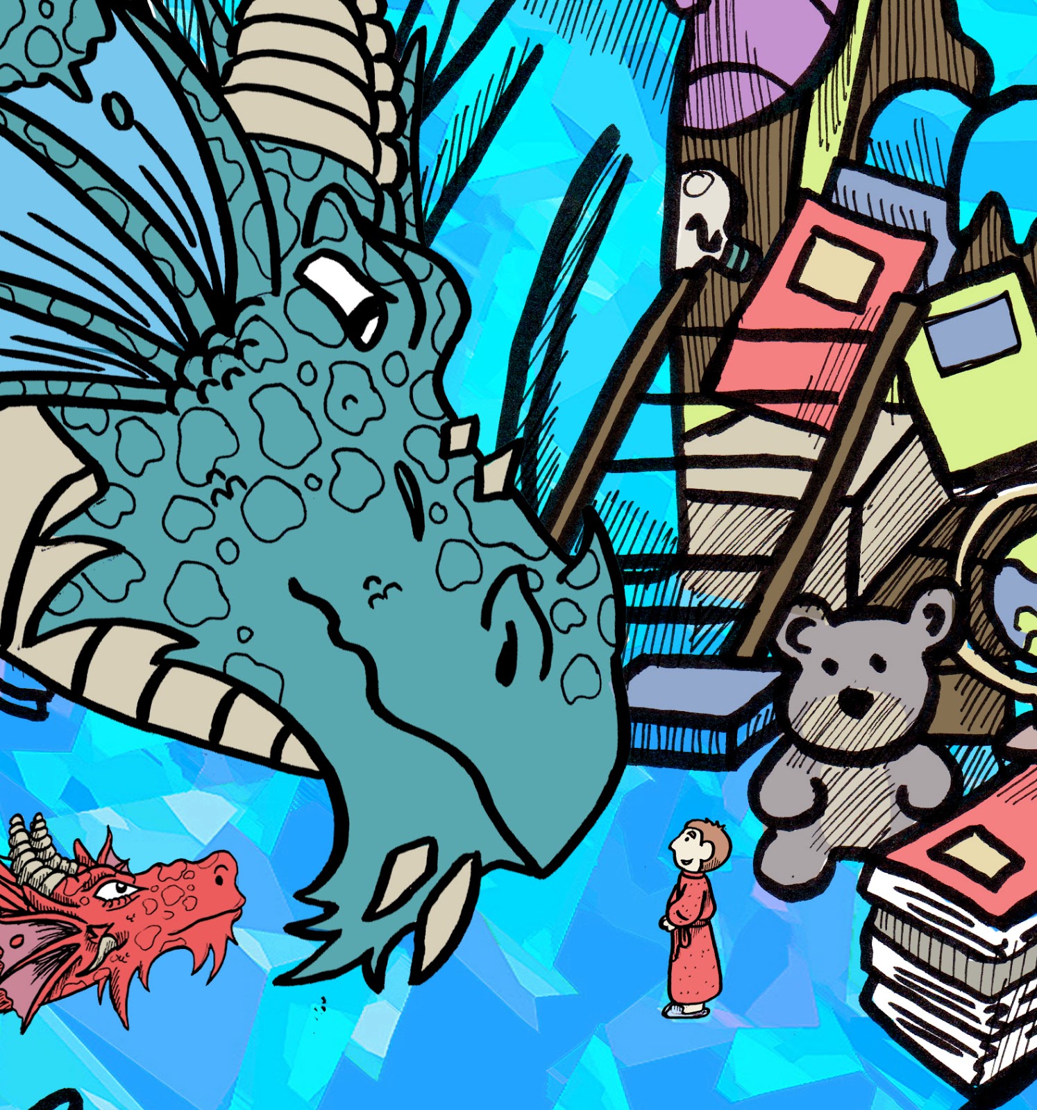
| Dolores advised keeping Charlie in the Image, otherwise the dragon having his head looking down at nothing looks weird. Using the same colours for each page. I have varied the off two or three, in the case of when I needed a grey for the lampposts ect but they're all pretty much the same colour scheme: paler backgrounds and stronger foreground colours. Really excited at how these are turning out!!!  |


I made them all quite pale so they don't print too dark. I also made this right image a lot darker to show it's night--time.


 Sorry about these lines on the images - the screen just did that. It's not on the actual image


I took the printed out pages of this scene to George who said the dragons were too dark - to differentiate between the background and the foreground, the background needs to be darker, and the dragons need to be lighter. So I went back over the last couple of pages of the book and tweaked the colours. Glad I did now because I can see what she means now. Depression stands out more against the cave now.
 Light vs dark
 So you can see how dark he was, and what he looks like now


 Now he's lighter and looks so much better!


I chose to do Anxiety really dark pink because the background of her cave, no matter how dark I try to make it, always camouflages her. So because the background was lighter, I made her darker so she stands out more.


 One of my favourite scenes in the whole book - I LOVE the colours in this one. Very abstract. Almost Piet Mondrian colours with the white and black ect.


I took the printed out pages of this scene to George who said the dragons were too dark - to differentiate between the background and the foreground, the background needs to be darker, and the dragons need to be lighter. So I went back over the last couple of pages of the book and tweaked the colours. Glad I did now because I can see what she means now. Depression stands out more against the cave now.


I chose to do Anxiety really dark pink because the background of her cave, no matter how dark I try to make it, always camouflages her. So because the background was lighter, I made her darker so she stands out more.


No comments:
Post a Comment