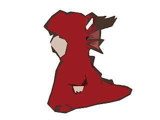
George told me the shape above of the dragons head is too ambiguous and It would be best to include some of my work on the front, with my drawings - to match the style inside so I chose this drawing as I thought It was the most powerful and intriguing. Below is the thought process I went through.
Wanted it more magical and darker. It looks too brown - but did like the additional colours - its suggesting the crystals that I said lined the walls
I printed this out to have a look at it and the overall image is just TOO DARK. The dragon is too neon too - he needs to be duller. Plus you cant really see Ben, so this needs editing. I do however love the purple; its a magical colour and makes it a lot more interesting that the boring brown cave.
I'm so happy so far - this looks so much better and more intriguing than the original idea of Charlie in a onesie, or The dragons head.
On further inspection' I decided the teeth might look a bit menacing for children; and due to the angle of the head, you wouldn't really see autism's chin or beard. So I removed it, and replaced it with a friendlier looking muzzle. Also I hated the design of Ben in this image so I chose an image from my drafts that I really think represents Ben well and put that in. This new image shows the laughter in his eyes and his playfulness. The new front cover looks so much better than the previous one - I feel I would be proud to show it and not have to make excuses as to why it wasn't '100% okay' I feel this is to a completed standard.


No comments:
Post a Comment